Windows 11 is continually changing, and new features are being released at a quicker rate. Microsoft is altering the widgets board once more, this time to make better use of your screen space.
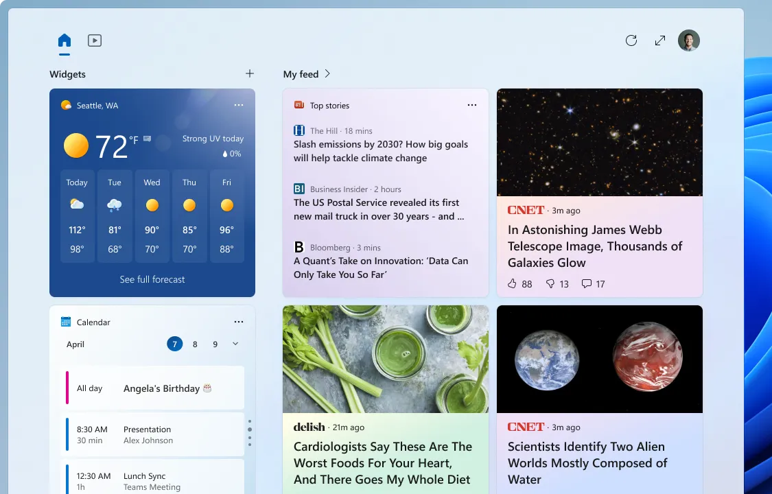
The widget board, which is accessed through a new icon on the taskbar and shows a grid of customisable widgets, was introduced in Windows 11. Windows 11 Insider Preview Build 25324 is now available on the Windows Insider Canary Channel, and it includes an improved version of the board with three columns — if your PC’s screen is large enough.
We are beginning to preview a revamp of the widgets board experience with a larger canvas (3-columns if supported by the device) and dedicated sections for widgets and feed content with a clear separation between them. This will provide users with quick access to glanceable content from their apps and services as well as enable users to take a high-value break with personalized news content.
Microsoft said in a blog post

Microsoft experimented with a full-screen widgets board in September 2022, but the effort did not appear to progress beyond Insider releases. This new design still only uses one half of the screen and does not cover the whole desktop.
Increased area for widgets is an improvement, however the present layout limits the amount of space widgets have in the panel to create way for recommended items. Microsoft should keep improving this, because the taskbar search menu currently has enough of recommended stuff.
Source: Windows Blog


Leave a Reply ▼