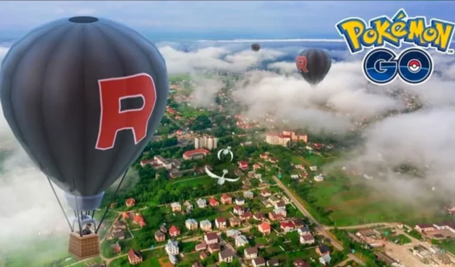
Pokémon Go players have been asking Niantic to spice up the designs of Team GO Rocket’s balloons, specifically to make them scarier.
With the recent Offensive event, Team GO Rocket has been on the minds of many Pokémon Go fans since the start of 2024.
While the Team Rocket line of Pokémon, both for the Minions and the top leaders of the evil organization, sees big changes from time to time, the iconic aesthetic of the evil team has always remained the same.
Now, some fans have called on Niantic to change Team Rocket’s appearance, as one fan argued that the evil team should look more intimidating after all these years.
Pokémon Go fans want Team Rocket to look scarier
A post on the Pokémon Go subreddit gained traction after a trainer said, “Team Rocket’s balloon design should be scarier in my opinion.”
team rocket ballon design should be more scary in my opinion byu/kromehearted inpokemongo
The author included a concept of what future Balloons could look like, showing a Balloon from Clash of Clans as inspiration for the direction of a new look.
Many fans wanted to see more variance in the aesthetic of Team GO Rocket’s balls. “They should also bring back James and Jesse’s hot air balloons,” one fan said.
This was in reference to the introduction of the anime’s characters into the mobile game many years ago, although the evil duo hasn’t made a resurgence in some time.
While some fans were certainly open to the idea of Team Rocket themed balloons during certain events, like Halloween, others said they would miss the iconic design.
“As someone who has supported Team Rocket’s shenanigans for the past 25 years, their balloons being black with a big red R on them is entirely in keeping with their character,” argued one fan.
Another trainer said, “They’re cartoon villains who steal magical animals from kids… On the one hand, they’re largely evil. On the other hand, the design just fits.”
While it would certainly be interesting to see the Team GO Rocket balloons change with the season or holidays, it’s hard to say that the iconic black design with the huge ‘R’ isn’t already perfect.


Leave a Reply